ANDAMEN
In collaboration with

Andamen does not make clothes. They engineer the feeling of arriving somewhere better. A bridge-to-luxury menswear label that already had the product and the loyal audience - what they needed was content that could hold the same weight as the garments themselves. So we built a visual language worthy of both.

Andamen sits in a rare position - premium enough to demand editorial-grade content,
direct-to-consumer enough to need it weekly. That tension is where most production setups
crack.
The feed was inconsistent. Not bad, inconsistent. Some weeks hitting the elevated,
sun-drenched, quietly-confident aesthetic that defines the brand. Other weeks slipping into
something more generic, more catalogue, more forgettable. The visual identity had no
throughline holding it together across categories - shirts photographed one way, tees
another, campaigns feeling like they came from three different brands.
What Andamen needed was not just better content. They needed a production system - one
disciplined enough to maintain quality at volume, and creative enough to make every single
asset feel intentional.


In collaboration with

Designing a Connected Car Companion App for the Next Generation of EV Owners
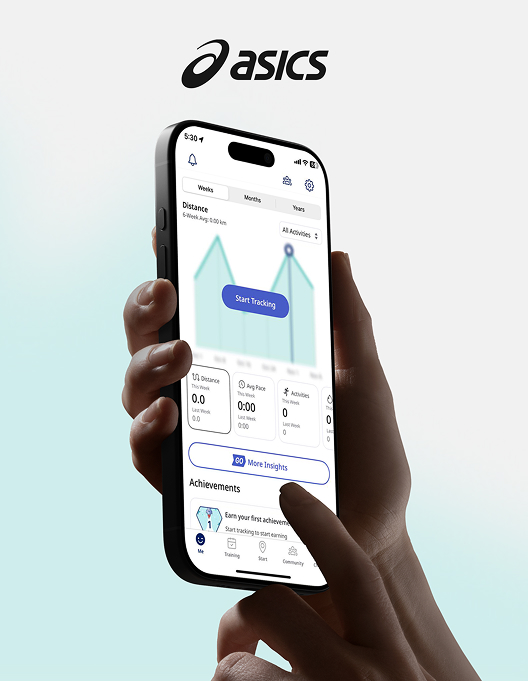
Crafting a Data-Driven Fitness Experience for Global Runners
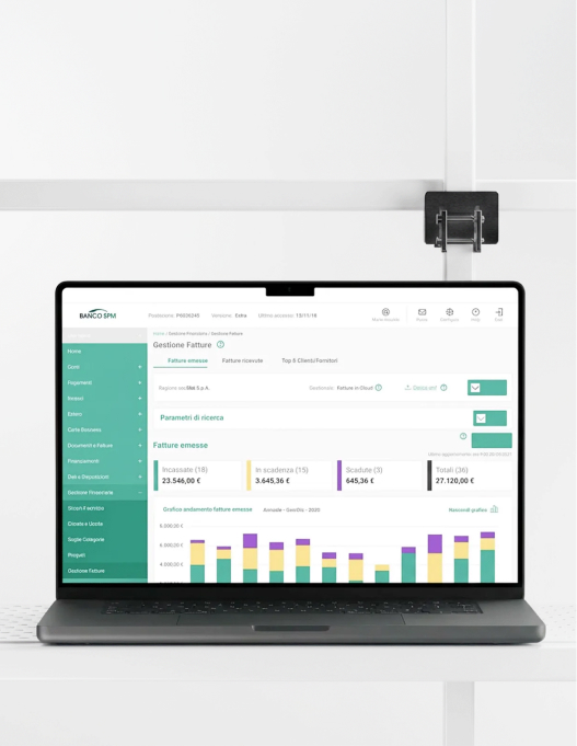
High-Clarity Dashboard and UX System for a Modern Financial Institution
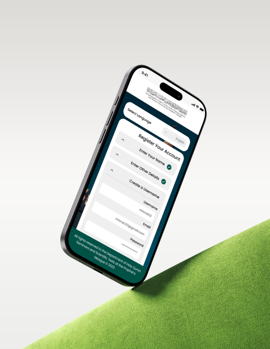
Crafting an Intuitive and Accessible Registration Journey for Pilgrims


Trusted by